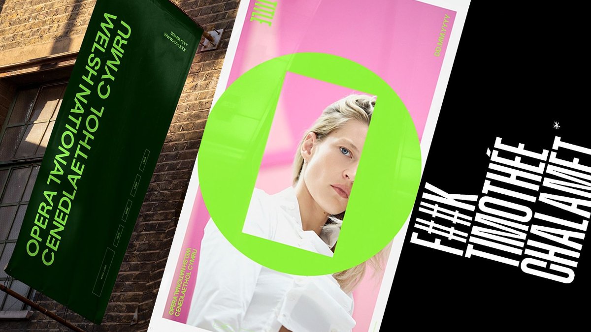
Welsh National Opera has rebranded ahead of its 80th anniversary, and the new identity by Welsh studio Bwtic is built around a single device: the ‘O Frame’, an O with an open rectangle set inside it. The outer circle stands for opera as a medium, the inner frame for each individual production — and the mismatch is deliberate, what Bwtic calls “square pegs, round holes”. It arrives with a bilingual wordmark that gives Welsh and English equal presence, and a typographic system developed from the GT Standard lettering used on the company’s 1946 debut poster.