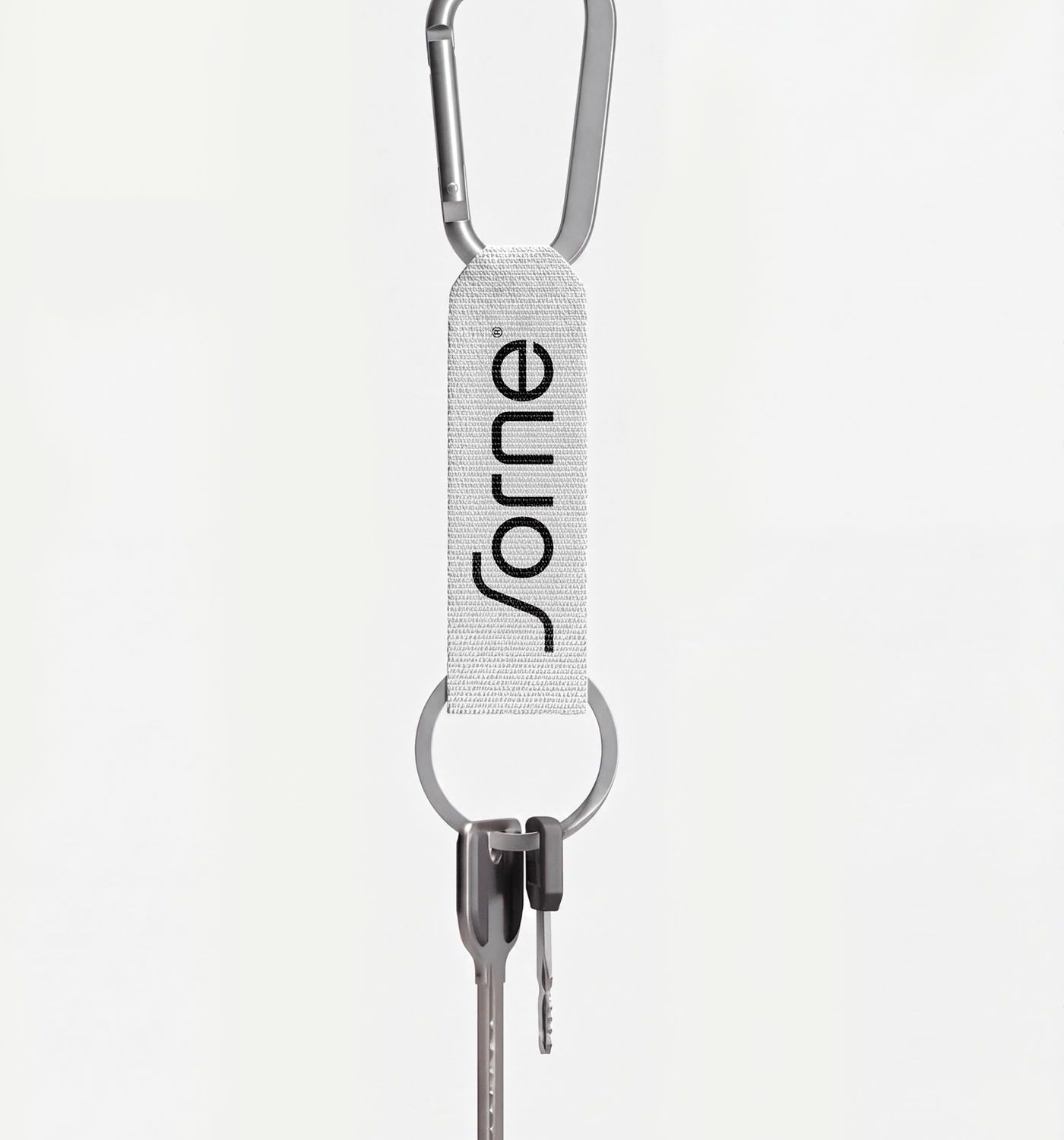
Creative director Gideon Phillip and the designers at KWIBA built a modular, grid-based identity for Sorne, anchored by a strict palette of deep soot black and chalk white with no decorative color. A heavy, structural sans-serif does the heavy lifting, its letterforms functioning almost as architectural elements to create immediate hierarchy across the print assets.