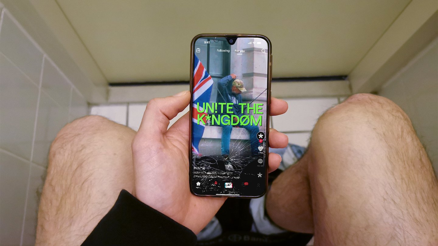
For Human, Zandland’s ambitious new documentary-journalism outlet, strategy and brand office Overview built an identity around credibility rather than institutional polish. The system draws on Jeffersonian transcription — the punctuation and glyphs used in conversation analysis to capture pauses, overlaps, and emphasis — treating type as a record of how people actually speak. Built from Display’s Saans typeface, it favours expression over strict legibility, aiming to feel observed rather than imposed.