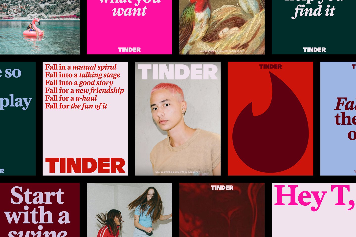
For its first rebrand in nearly a decade, Tinder brought on Porto Rocha to build an expressive new design system — a reworked wordmark, a new serif typeface, and a mix of anime screenshots, oil paintings and “it us” memes. The result gives the app a distinct point of view, designed to speak to a new generation without trying to speak to everyone.
Source: itsnicethat.com

