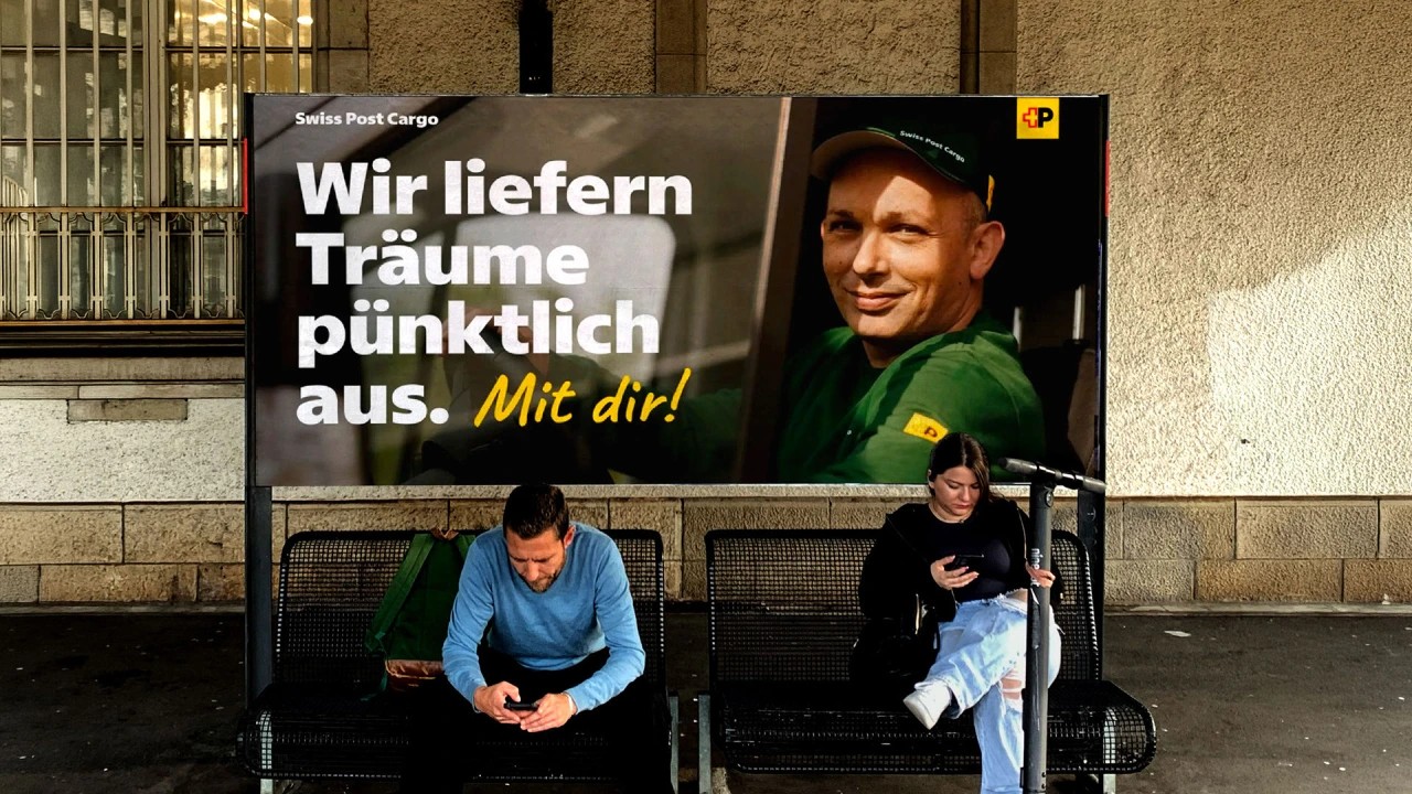
Over three years, Swiss Typefaces built Swiss Post a custom family that had to drop straight into existing layouts by swapping font files, so it keeps its predecessor’s typographic volume while warming up the tone with humanist shapes and round i and j dots. Numerals are tabular by default for prices and timetables, the family covers German, French, Italian and Romansh, and the italics borrow cursive forms for a, b, e and g instead of simply slanting the uprights. With the logo now built on an upright P, those italics become a brand voice of their own across signage, vehicles, stamps, mailboxes and apps. Source: Creative Boom