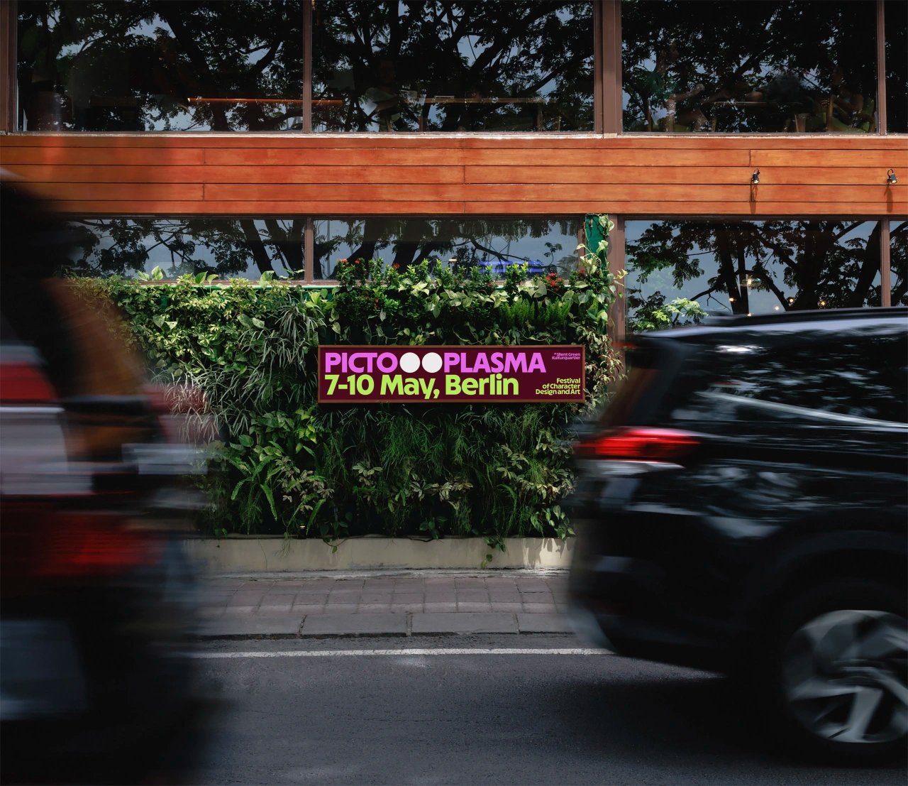
After 20 years of deliberately neutral design, Berlin’s Pictoplasma character design festival now has a personality of its own, courtesy of Vilnius studio andstudio. Rather than drawing a mascot that would compete with the artists it showcases, the team added a two-eye glyph to a customised rounded typeface, so any word can become a body and our instinct for pareidolia does the rest. The system stretches from print to festival tents and guerrilla dot stickers, with colours and layouts changing city to city while the type and the dots stay constant. Source: Creative Boom